CASE STUDY — CARVANA
Redesigning Sell
to Carvana.
Carvana is a fully digital platform for buying and selling cars. Sell to Carvana is one of its highest-intent experiences where people arrive ready to get an offer on their car.
I led the redesign end to end, from landing through offer, alongside Carvana's evolving brand direction.
ROLE
PLATFORM
Product Design Lead — Shaped scope, strategy, UI, and brand translation
TEAM
iOS, Web
SCOPE
Product Design, Design Systems, Visual Design, Product, Engineering
End-to-end experience redesign
DURATION
3 months
01 — THE PROBLEM
Too many questions, not enough reassurance.
At a glance, the flow seemed simple: enter your vehicle info and get an offer. But users were asked for detailed inputs before understanding how those answers would affect their value. When effort feels high and the payoff feels unclear, hesitation follows, and that's where drop-off showed up.
02 — STRATEGY
Looking at what builds trust.
I looked at products that handle high-trust decisions well to understand how visual clarity supports confidence.
Strong hierarchy, transparency at the offer stage, and setting accurate expectations upfront all reduced hesitation. Structure and presentation would matter just as much as the flow itself.

03 — USER INSIGHTS
Testing revealed four
clear themes.
We tested with people actively trying to sell their car across desktop and mobile. Each theme directly shaped the redesign.
Expectations Set
Too Early
Early messaging built confidence that appraisal didn't deliver on.
Uncertainty in Appraisal
Users second-guessed themselves entering mileage, features, and vehicle details.
Transparency
Built Trust
Understanding what drove their offer value made users more comfortable moving forward.
Next Step Wasn't Clear After Offer
After receiving an offer, many users paused. Direction was missing.
04 — STRUCTURE
Building clarity before adding color.
A single primary path kept momentum high. Appraisal was broken into progressive sections to make a detailed process feel manageable, and decision points were simplified by removing unnecessary branching. On the offer, details were positioned to support understanding before asking users to commit.
05 — DESIGN SYSTEM
Strengthening the foundation, not just the flow.
This flow exposed gaps in the existing system. Rather than one-off fixes, I audited core components, refined patterns to support clearer decisions, and partnered with Design Systems to productionize them into reusable components aligned to Carvana's updated brand direction.
06 — FINAL DESIGNS
Where structure meets visual direction.
Landing Page
The goal was immediate reassurance. Lifestyle imagery made the experience feel approachable rather than transactional, paired with strong hierarchy so the primary action stayed clear. Supporting content like reviews and education built confidence without competing for attention.
Appraisal
Visual calm mattered most here. Consistent layouts and minimal noise kept users focused without second-guessing. The goal wasn't to impress visually, it was to reduce perceived effort.
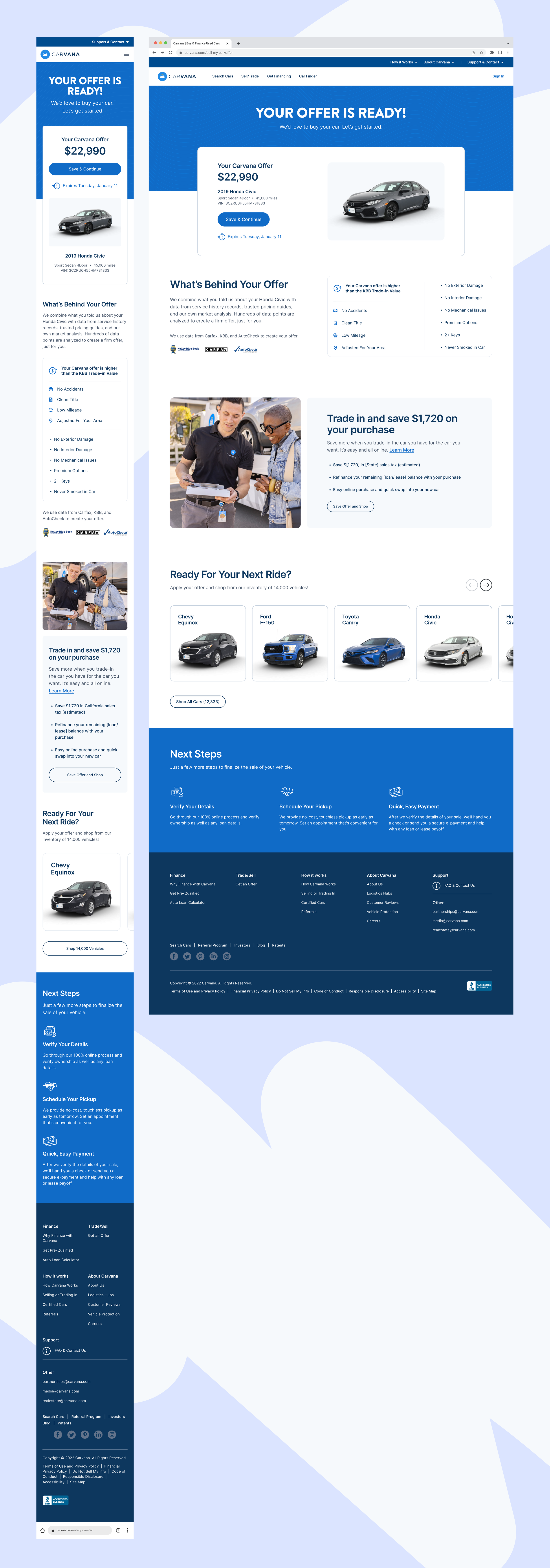
Offer
The offer amount leads, followed by a transparent breakdown and clear next steps. Lifestyle imagery returns to re-humanize the moment, reminding users this is a real outcome, not just a number on a screen.
07 — IMPACT AND REFLECTION
A more confident path to offer accepted.
Impact
Structuring appraisal and clarifying the offer breakdown reduced hesitation at key decision points. One of the first translations of Carvana's updated brand into a complex product experience.
What I'd Do Differently
More focused usability sessions on appraisal questions would have surfaced where language created doubt. Better upfront expectation-setting would have reduced drop-off further.
What Went Well
Early cross-functional alignment kept the team moving together. Design shaped structure from the start, not just the surface at the end.
Future Considerations
The patterns here created a foundation to scale across future selling experiences.
NEXT CASE STUDY
Mint Mobile Plan Purchase