CASE STUDY — MINT MOBILE
Enabling In-App Plan Purchase
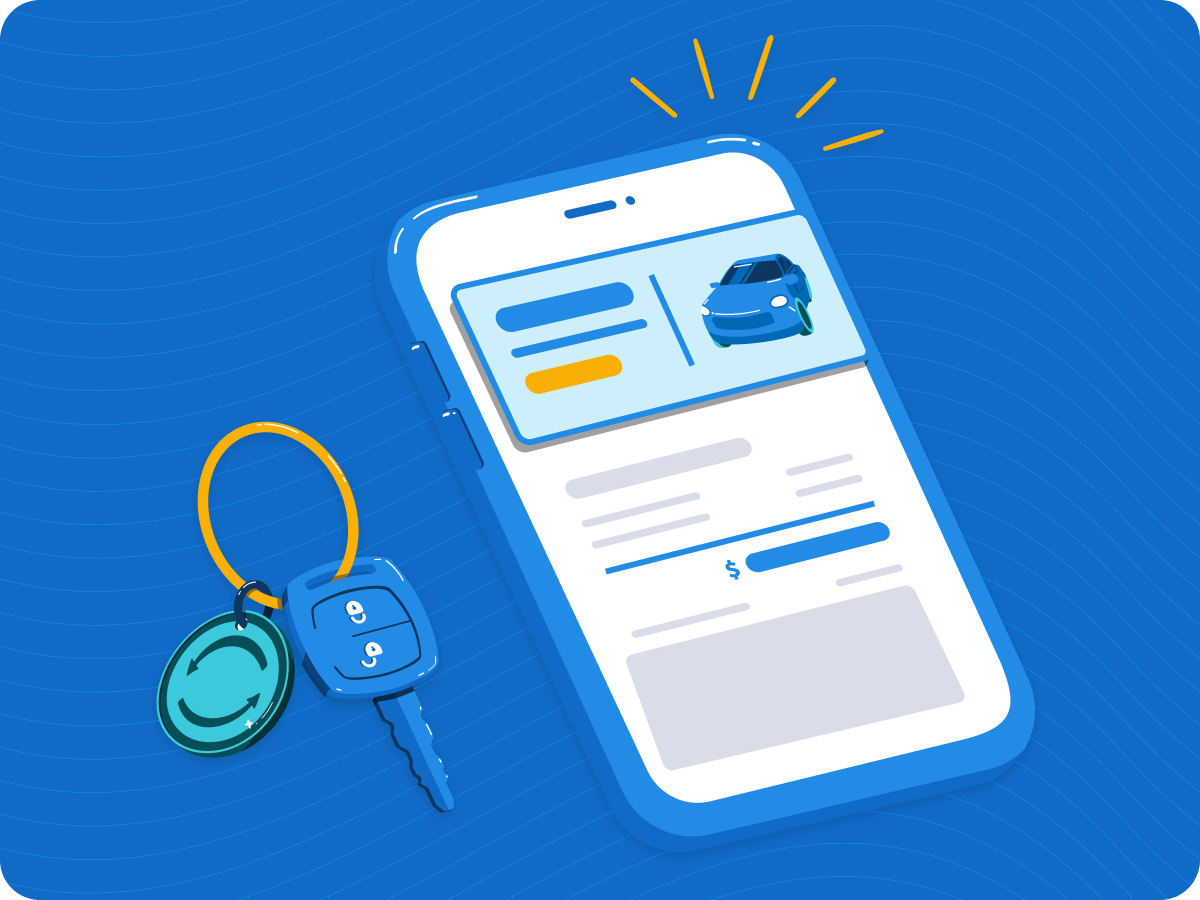
Mint Mobile is a prepaid wireless carrier that sells plans direct to consumers. This project was about enabling plan purchase inside their native app.
ROLE
PLATFORM
Product Design Lead —
shaped scope, structure, & UI
TEAM
iOS
SCOPE
Product, Marketing, Engineering
End-to-end flow design
DURATION
7 months
01 — THE PROBLEM
The gap between intent and conversion.
The app handled activation and account management. Users who opened it ready to buy had to leave and finish on the web, which was friction at the worst possible moment.
The Opportunity
1,000+ users per day opened the app ready to buy. None of them could complete a purchase.
The Goal
Give people a way to do what they were already trying to do. Purchase a plan without leaving the app.
02 — STRATEGY
1,000 users a day, but none could buy a plan.
The logged-out app state was self-contained enough to introduce purchase without touching complex post-login systems.
Native meant we could support eSIM compatibility and coverage checks upfront. This wasn't just a UX enhancement. It was turning the app into a real acquisition surface.
Value
Low-impact area to introduce change
Faster native purchase experience
Risk
Assumed app users were ready to buy
Risk of pulling users off the free trial path
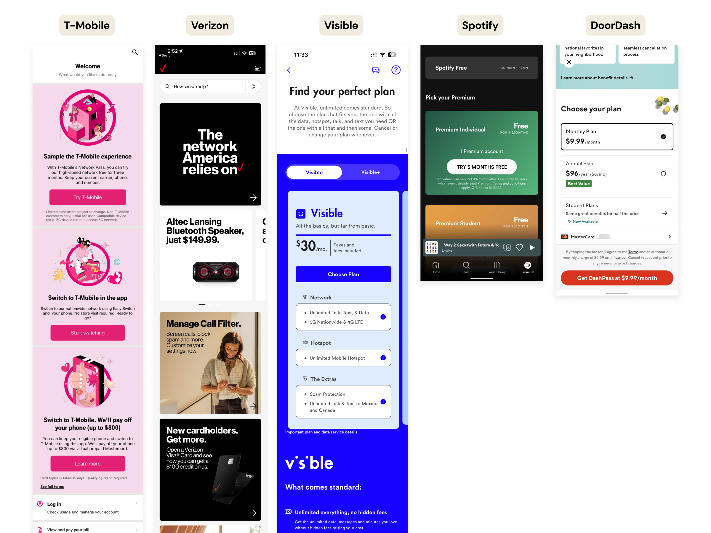
RESEARCH & INPUTS
Entry points should support different intent levels. Education and purchase can coexist. Plan selection works best with clear hierarchy.
Key Market Insights
03 — APPROACH
Building the brief together.

Work like this would typically come to design as a finished brief. I pushed for something different. Before any screens were designed, I brought the cross-functional team together to co-create the wireframe brief, align on success criteria, and pressure-test decisions at every phase.
One designer. Three teams. Every decision made together.
A purchase flow built for how people actually use their phone.
04 — THE WORK
FLOW STRATEGY
User Flows & Wireframes
DESIGN
Design Highlights
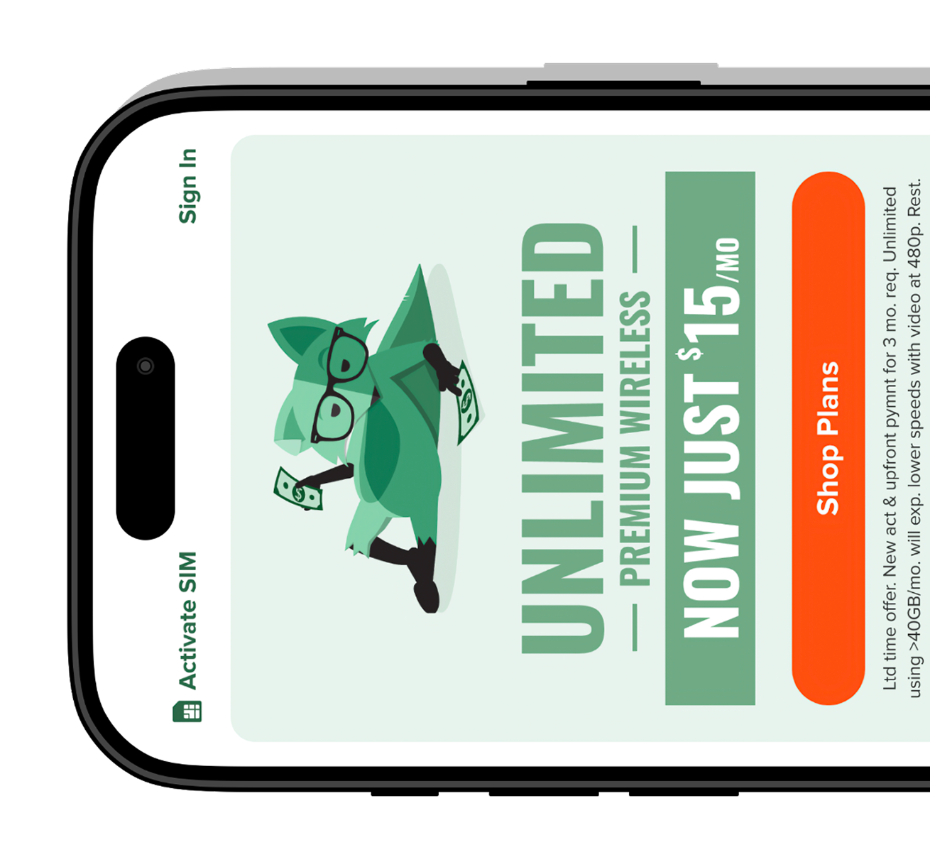
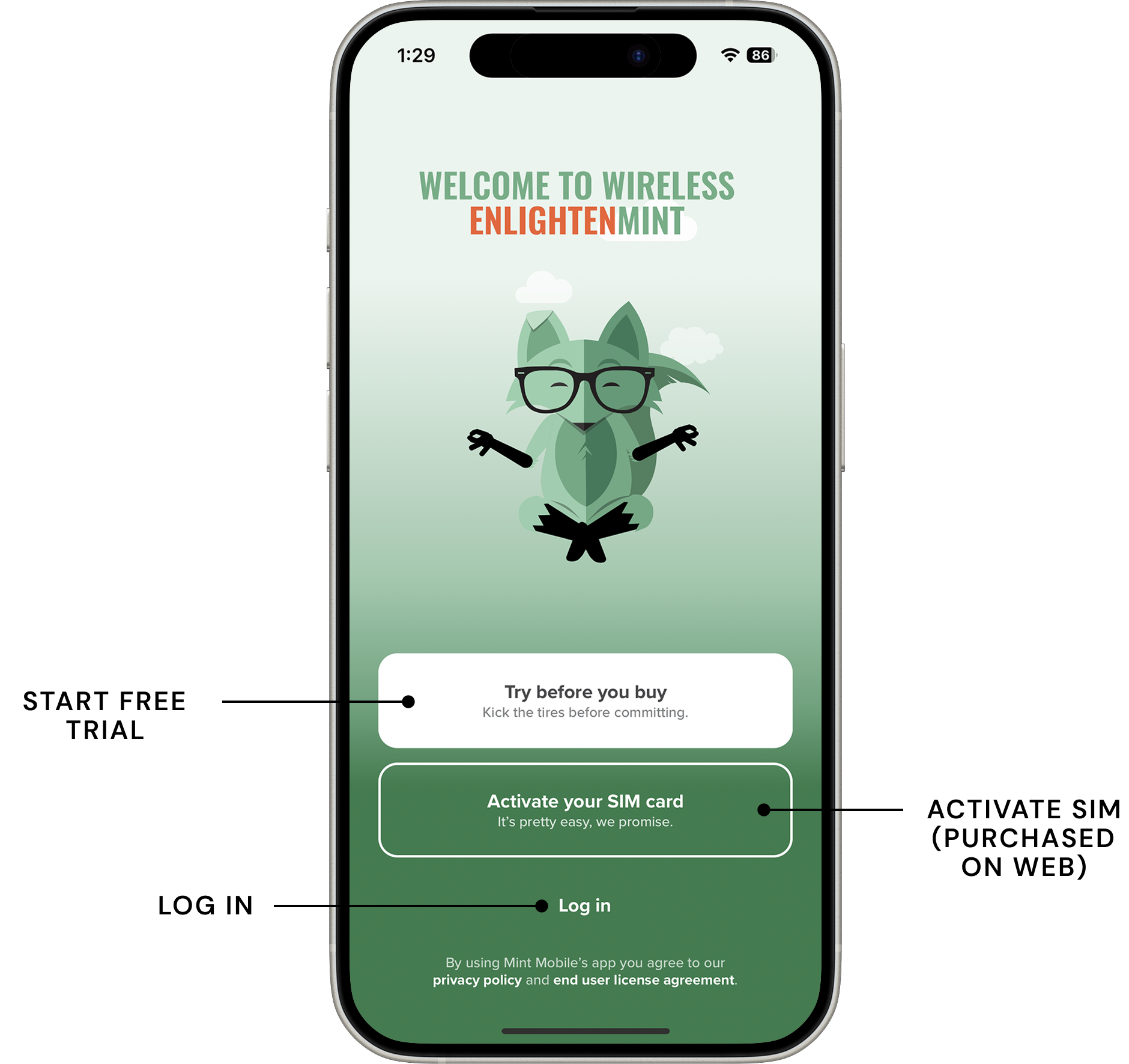
Intro Screen: Two variants handled from a single entry point: one with an active promo, one without. No branching in the flow.
Plan Selection: Renewal pricing was deliberately kept off this screen. Showing it risked losing users before they experienced the value.
SIM Selection: eSIM and pSIM route differently from this point. Device detection happens natively so users don't have to self-identify.
Coverage Check: Real-time results shown in two views: dial and map. Gives users confidence in coverage before committing to checkout.
Checkout: Broken into discrete steps to reduce cognitive load. The recovery fee surfaces inline with an explanation rather than appearing as a surprise at confirmation.
05 — OUTCOME
The numbers showed up fast.
500+
Plan purchases within the first few days of launch, significantly exceeding initial expectations.
USER RESEARCH
Testing After Launch
After launch, the team ran a remote moderated usability study with 10 participants actively considering switching carriers. Three things stood out.
01.
Plan Selection
Users understood the options but lacked context for a confident decision. Renewal pricing was deliberately kept off this screen, flagged for the next phase.
02.
SIM Selection and Coverage
The coverage check landed well but users wanted a broader map view. eSIM users expected automatic compatibility confirmation. A clear opportunity for the next release.
03.
Checkout
The recovery fee surprised most users at checkout. Even with an inline explanation, the framing introduced hesitation at the worst possible moment.
MEASUREMENT & LEARNINGS
What I Would Have Measured
We didn't have full visibility into post-launch data. Measurement was owned by a separate team and not always defined upfront. Here's what I wish we had tracked.
IMPACT & REFLECTION
Final Thoughts
What Went Well
Design being in the room at kickoff made a real difference. We shaped what we were building, not just how it looked. Working sessions kept the team aligned and that door into strategic conversations stayed open.
What I’d Push Further
With more time I would have pushed the visual craft further and tested entry screen messaging earlier. We were working without a mature design system, which meant too many decisions made on the fly.
Drop-off at each step in the purchase funnel
Which plans converted and which ones users considered but didn't choose
How Buy vs. Try framing affected which path users chose
Whether in-app purchase cannibalized free trial gross adds
eSIM vs. pSIM completion rates
NEXT CASE STUDY
Sell to Carvana